Prometheus in greek mythology was a Titan who stole fire from Zeus and gave it to the mortals. For this outrage, Zeus had him tied to a rock while an eagle ate his liver for the rest of eternity...
If this wasn't enough of an epic prologue to the name Prometheus, than the trailer for Ridley Scott's possibly-is-possibly-isn't-precursor-to-Alien should be the tipping point. This film is going to be great.
Now Empire magazine has already dissected this trailer and a number of youtube vids have followed suit so I'm not going to repeat what is already offered. Instead my take on this is from the angle that I originally intended this blog to be about; design.
So let's get straight into it:
STYLE:
It's debatable whether you would design a films aesthetic looks to be an obvious reference to a previous film in a series because it has to actually fit this existing world or whether you are taking the nostalgic route for a specific fanbase. Needless to say the entire trailer has the same feel and look to it as the Alien trailer and feature did back in 1979. It's more than likely that the designers Giger, Ron Cobb, Moebius and Chris Foss to name a fiew have not worked on this film but the many artists from David Vyle Levy to Ben Procter can be trusted to bring this familiar world back in a great way. Besides, with Ridleys background being in design, it would be fair to say if he had all the time in the world he could take on all design roles himself if he wanted to. Looks great so far Ridley...
SPACE:
We see space and if it makes sence to readers this looks like 1970s space. This is a quiet place. It's not hightened by fast paced Star Wars prequel action scenes or mad cap explosions. This looks like it resembles the sci-fi we loved from the late 70s when 12 foot miniatures would silently loom past the camera into an endless star covered canvas.
VEHICLES:
Again a feeling we have come straight off the Nostromo and found some similar craft. These ships including the trucks have the bulky quality as previously seen. In particular, the trucks and machinery is more likely to remind people of the military feeling James Cameron went for with his sequel. Looks cool all the same in particular the use of the Weyland logo (the evil corporation with sinister plans in all the Alien films)...
LANDSCAPE:
The terrain and atmosphere has been compared to LV-426 the original Alien planet. Certain shots do bare resemblances to this but Im not sure about one of the more sandy backdrops where a vehicle heads back to a landing ship. All the same these environments look like great locations for some great action pieces as we see later in the trailer.
As my next post will mention I loved Super8 this year and that was suited to my nostalgic sensibilities as does this trailer. Plus it's Ridley Scott back where he first broke out.
Can't wait...

Wednesday, 28 December 2011
Monday, 19 December 2011
Movie news to end the year
So as I previously commented, my blogs have become rather lack-luster.
But I have decided, after quite an exciting evening of web viewing, to write about my viewings of today.
There is nothing better than the excitement and anticipation for future releases and events and while this year has certainly given us some promising titles to remember 2011 by (I opened my blog with a lengthy appreciation for Nicolas Winding Refn's Drive), I can't help look toward to 2012 and two genuine epics. Firstly;
THE DARK KNIGHT RISES
Anyone excited about this release and is following even basic reports of the films production will be aware of the prologue that is at the beginning of Mission Impossible: Ghost Protocol. A 6 minute segment that introduces Bane to Christopher Nolan's Gotham City world featuring an elaborate plane sequence which is pretty cool to put it bluntly. Then later tonight this comes across the youtube channels; Trailer number 1!
To say it looks good would be an understatement and while it may not have the supreme hype that The Dark Knight did (I just rewatched this myself and remembered just how exciting it was. I watched this like 30 or 40 times), it still packs an exciting punch. Shame it lacks that punchy soundtrack and sinister voiceover but Bane still has what seems the best line at the end of the trailer.
Finally just as I was looking to bring my evening to a close, I fell upon an acquaitance's post that had me REALLY excited...
PROMETHEUS
This film is easily my favourite hyped movie for next year! For now I can't elaborate on a lot of the film as we need a trailer. Alas that will arrive thursday all thanks to this video. WOWZERS!!! Ridley Scott back in his old sandbox and it looks like he knows what he's doing. I love nostalgia, I really like the first two Alien films and I really like the look of this film! Thursday I'd like to post an indepth piece on what I truely hope will be the most exciting 3 minute advert this year!
Speak soon friends
Sunday, 20 November 2011
First of many...
OK so this is more than likely the first of many apology posts in which I say sorry to the minimal people who read this. My updates have become fairly scarce recently and I know at least for this week it's not going to get any better as Im pretty busy.
Currently on a good turn as a storyboarding project Im working on is starting to look pretty cool as we progress further with it. Hopefully some more news later this week and also hope to get back to some design updates in the future.
I think a major discussion on a film again soon word be worth while as well as the end of year Top 5 Films of 2011 voted by... me.
So sorry again and speak soon I hope...
Saturday, 5 November 2011
A few doodles
Hello all.
Quick update featuring these little black and white white sketches using various brushes to quickly create a design composition. Each took about 20mins and Im gonna do these as warm ups each day and store them away for a rainy day :)
They remind me of black ink on scratchboard sketches that I used to look at by Vincent Di Fate. Love his work as far as analogue artists go. If you get the chance, read his book as he also talks about his passion for film in particular the monster B-movies of the 50s and 60s.
Anyway catch up soon,


Tuesday, 1 November 2011
Hanging Sci-fi scene part 1
The notion of a hanging city has become more apparent to me within the concept art world over the last 5-10 years. Visually intriguing to say the least and Im sure one day, will appear as a key location in a film (if it hasn't already). Although Im sure it wasn't first seen here, I'd have to say the first time I became aware of the idea was of course the concept art knocked out for the Star Wars prequels.
Here's a brief backstory to the art:
Typically entitled 'BridgeWorld' many artists early on in the production were given a short brief; the clone wars will be seen in a handfull of planets that are new to the viewer. While the artists were given certain free reign over the subject, there were also key issues with each design. As these locations were brand new and were to be on screen for literally a matter of seconds the difficulty came with giving each location a specific design style/language that would be obvious to the viewer that they were seeing several different places. Among them were a giant plant-life planet, a crystal world and of course an upside down environment.
Enter Bridgeworld aka Cato Neimoidia.
So back on track, the other day I began to work on an environment design. My intention initially started with creating a large arching set of livable buildings that looked more like extreme bridges. I wanted a dusty washed out look and so started searching for dust cloud pictures as reference. As I messed about with them I inadvertantly flipped a picture vertically and low and behold saw the potential to create my own upside down world.
So with these next few posts I'll hopefully continue to show my thought process and work flow as I go through the design. What I have here to show you is the initial 45mins-hour of arranging things to a place where I feel a composition and story could be told. So here is my first step to my bridgeworld; my upside down planet; my Cloud City if you will. This is Hanging Sci-Fi Scene part 1...

Tuesday, 25 October 2011
Painter pro? Not so mucho...
Short one again. I've been taking the time (finally) to attempt to make more use of Coral Painter. Tutorials from Ryan Church are brilliant help. Very basic sketch that needs major work. I hate looking at work like this even though I'm new to the program I expect better lol Anyway here it is below. Maybe a movie post next time...


Friday, 21 October 2011
Is it a bird? is it a plane? umm yeah it's a plane...

Posting a fresh concept painting right after its been done. If it had been painted traditionally it would still be wet! (but it's not so don't worry).
This week after a run of inspired videos from Coral Painter Pro, Ryan Church I had the bug to paint something in the air with some of the skills I had picked up from his tutorials. While his lessons didn't necessarily bring anything revolutionary to the table, it certainly refreshed my knowledge and approach at times. As a major Feng Zhu fan, I'll admit my biased ways of following his work purely on it's own is a very narrow minded view to see the industry but Ryan Church's tutorials have genuinely opened me up to a broad acceptance of concept design. I'm probably digging myself in right now but I have and always will enjoy concept art in general but was always taken by Feng Zhu's design style. Now I am looking to follow a collection of other designers more so...
Anyway enough gasing. Check out the new design which is the last image on my personal work page here.
Monday, 17 October 2011
Car rear
So here is my first proper 'design' post. Been admiring the renderings of Harald Belker and Daniel Simon of late. Feel I needed to work on my general vehicle drawings. Below is the sketch I knocked out today. OK for a starter but I plan to improve vastily on the next one (hence why I'll show it on here and not on my actual portfolio). A good render can't save a poor design and to be brutal, the sketch wasn't as polished as I could have done. The next one I'll work hard to improve!


Wednesday, 12 October 2011
SiteShoutOut
Very quick post. Recently came across DesignerMart which gives various tutorials on photoshop rendering of vehicles. Nice little site for students and semi-professionals who might like to refresh their knowledge/methods of car design.
That is all
That is all
Sunday, 9 October 2011
A Real Hero...
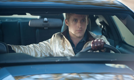
So to follow on from my previous humble beginnings of this blog, I am going to quickly explain the movie that has been replaying in my head the past two weeks and determine why it had such an impact.
Drive, is already being recognised by critics as a stand out film of the year and having heard the hype and seeing the VERY promising trailer, I awaited the film with much excitement. More about this in a second...
A trailer has two to three minutes to completely gain your interest and belief that your hard earned cash would be best spent in a dark room in silence for 90 minutes or more. For a 90 minute film you have to assess less than 3% of a films visuals to decide on whether you will watch the other 87 minutes. That's a tough assignment for anyone. So Drive must have done this pretty damn well for a film fan such as myself to get behind it.
Key visuals always pack a hard punch and in film these are incorporated into moments or key scenes of a plot. So what did Drive have that I loved enough to see more;
- LA at night. Sweeping shots from the sky of varying skyscrapers and nightlife dominating the horizon. Maybe it harks back to the tech-noir style of that opening shot of Blade Runner; a burnt skyline of industrial architecture bleeding into the distance. The director Nicholas Winding Refn has previously stated that he categorizes the movie as neon-noir. Perhaps not a direct relation to the sci-fi classic but there are parallels in my mind...
- Ryan Goslings speech. Quick, precise and to the point would not only be how he deliveres the basic principal of his job but also the way the trailer is cut together with a beating score resembling the pace of a stop watch on borrowed time. Pace can make or break the attention span of the viewer...
- Locations. Minimal in many ways but stylish to the hilt. Anyone who knows about this film will have probably heard about 'that elevator scene'. Shot so artistically it only heightens the sudden violent impact moments later. Another point that I've come across in the trailer is the view of the locations; not static shots but slow moving and paning views. These could be seen as the drivers mid-height view from a car thats slowly crawling the streets.
- Colour. The colours are often strong, vibrant and warm, not cold as you might suspect. Rather than cold tones to show a merciless vengeful assailant, the warmth shows his actions are emotionally fuelled. This is the Cowboy with No Name who is silent in speech but loud through his actions. Rooms and corridors are warm.
- 80s nostalgia. OK, not for everyone but I for one am a fan of nostalgia trips. One of the best examples this year is Super8 and it's nostalgic for a decade I didn't even witness! The poster is intriguing enough with that hot pink font (Mistal I believe) and the soundtrack is just amazing from the get-go! Two particular tracks are now in my own music library; Kavinsky's Nightcall (feat. Lovefoxxx) and College's A Real Hero (feat. Electric Youth). 80s electo pop hasnt been so cool!
I wasn't sure where this post would eventually take me but with these pointers based on the trailer alone and personally having seen the film I'm left with two things:
1- a montage of shots dripping with style scored to the thumping beat of Nightcall and
2- a need to get in a car and drive the street with no end goal.
Film at its best transports us somewhere else for a while and if I continue to travel to that place in my mind then it's done its job. That or I'm losing the plot. Oh well, where are my keys? I'm going for a drive...

edit:
Having written this over the weekend, this story recently made its way to me. Man, people infuriate me! This woman really doesn't help with the stereotyping of American people! (My apologies to Americans, I really like the USA, just not people who are this stupid...) WOMAN SUES OVER MISLEADING TRAILER
Friday, 7 October 2011
Website 2.0
So now I pretty much have everything in its place on the site and I finally bit the bullet and bought my domain name. May seem trivial but it was something I had put off for some time. To have the professional title I wanted enough work to seem professional too. Backwards, yes; necessary, I think so.
So enjoy my site which for the time being may not have a whole lot of new stuff but I can promise you it will continue to grow as will this blog. I'm already thinking of taking the time to write about a film that has been stuck in my head for the past two weeks! More on that soon...
So good night all and don't forget to check out the site.
Wednesday, 5 October 2011
Subscribe to:
Comments (Atom)